Writing for accessibility
We’re always working to make our content more accessible and usable to the widest possible audience. Writing for accessibility goes way beyond making everything on the page available as text. It also affects the way you organize content and guide readers through a page. Depending on the audience and country, there may be laws governing the level of accessibility required. At minimum, an accessible version should be available. Accessibility includes users of all mental and physical capacities, whether situational (broken glasses!) or more permanent.
Basics
We write for a diverse audience of readers who all interact with our content in different ways. We aim to make our content accessible to anyone using a screen reader, keyboard navigation, or Braille interface, and to users of all cognitive capabilities.
As you write, consider the following:
- Would this language make sense to someone who doesn’t work here?
- Could someone quickly scan this document and understand the material?
- If someone can’t see the colors, images, or video, is the message still clear?
- Is the markup clean and structured?
- Mobile devices with accessibility features are increasingly becoming core communication tools, does this work well on them?
Guidelines
Avoid directional language
Avoid directional instructions and any language that requires the reader to see the layout or design of the page. This is helpful for many reasons, including layout changes on mobile.
Yes
Select from these options (with the steps listed after the title).
No
Select from the options in the right sidebar.
Use headers
Headers should always be nested and consecutive. Never skip a header level for styling reasons. To help group sections, be sure the page title is H1, top-level sections are H2, and subsequent inside those are H3 and beyond. Avoid excessive nesting.
Employ a hierarchy
Put the most important information first. Place similar topics in the same paragraph, and clearly separate different topics with headings.
Starting with a simple outline that includes key messages can help you create a hierarchy and organize your ideas in a logical way. This improves scannability and encourages better understanding.
Make true lists instead of using a paragraph or line breaks.
Use descriptive links
Links should provide information on the associated action or destination. Try to avoid “click here” or “learn more.”
Use alt text
The alt tag is the most basic form of image description, and it should be included on all images. The language will depend on the purpose of the image:
- If it’s a creative photo or supports a story, describe the image in detail in a brief
alttag. Our convention is to use full sentences foralttext, including end punctuation. Supplement images with standard captions when possible. - If the image is serving a specific function, describe what’s inside the image in detail. People who don’t see the image should come away with the same information as if they had.
- If you’re sharing a chart or graph, include the data in the
alttext so people have all the important information. - When describing an image, avoid saying “image of.” For example, if you were writing the
alttag for a pie chart, don’t caption it as “image of pie chart,” since the screen reader will read that as “Image, image of pie chart.”
Example
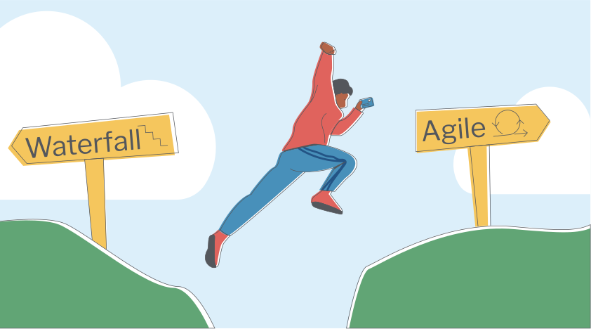
<img class="img-fluid" src="/img/toolkits/accessibility/agile-acquisition-framework.png" alt="Waterfall sign on left cliff. Agile sign on right cliff. Man jumping from left cliff to right cliff.">
Make sure closed captioning is available
Closed captioning or transcripts should be available for all videos. The information presented in videos should also be available in other formats.
Be mindful of visual elements
Aim for high contrast between your font and background colors. Tools in the resources section should help with picking accessible colors.
Images shouldn’t be the only method of communication, because images may not load or may not be seen. Avoid using images when the same information could be communicated in writing.